Published by Ishan Khosla
Ishan Khosla (b. Kochi, 1976) is a visual artist and designer with an MFA in Design from the School of Visual Arts, New York. After studying and working in the US for more than a decade, Ishan moved to India in 2008, to start Ishan Khosla Design — a multi-disciplinary company that examines and experiments with various aspects of contemporary Indian culture through the language of design.
Ishan’s work straddles the worlds of art and design, of tradition and technology, of nostalgia and the future and his experience of having stayed both outside and within India. Exhibitions include, Bold — Graphic Design from India at London Design Festival at the Rich Mix Cultural Foundation, London; Crossing Visions V: The Ecology of Creation, at the Fukuoka Asian Art Museum, Japan; Fracture: New Directions on Contemporary Textiles at the Devi Art Foundation; Porosity Kabari at Nishi Gallery, Canberra Australia and Studio X, Mumbai; Make it New Again, National Institute of Design, Ahmedabad; Common Ground at Gallery OED, Kochi and Edge Condition, Spitalfields Gallery, London.
Ishan's work is part of the permanent collection at the Powerhouse Museum in Sydney and has been published in various books including the V&A’s India Contemporary Design: Fashion, Graphics, Interiors. He was invited by The Japan Foundation to visit Japan as part of the Asian Curator’s Program; he visited the Netherlands on invitation from Dutch DFA and Government of Netherlands to create partnerships in design and culture between the two countries. Ishan helped organise, brand and facilitate, Sangam: the Australia India Design Platform. He also participated in talks and exhibitions at various venues in both India and Australia, including the Powerhouse Museum in Sydney and RMIT University in Melbourne. He was a part of two separate workshops, discussions and exhibitions at Studio X, Mumbai — Here, There, Everywhere (with Droog Lab) and — Porosity Kabari with two other Australian designers.
Ishan was a speaker at Typo Berlin in May 2017. Previously, he has spoken at Semi-Permanent (New Zealand), the Gyeonggi Ceramics Biennale (South Korea), Maison des Sciences de l’Homme, France; Japan Foundation (Japan); Aalto University (Finland); Konstfack University (Sweden); RMIT University (Australia) the University of Edinburgh (Scotland) among other places. He is a finalist of the Young Creative Entrepreneur Award by the British Council and has won the D&AD Kyoorius Design Yatra blue elephant for Best Book Design in 2016.
Ishan has taught design and photography at various colleges such as the National Institute of Design (NID), University of Edinburgh, Design Akademie Berlin, MIT Pune, Adianta, Design Village, Indian Institute of Art and Design (IIAD), Indian Institute of Craft and Design (IICD), United World Institute of Design (UID) and Adianta.
View all posts by Ishan Khosla


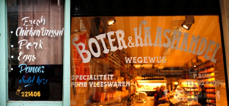
What if you changed up the pairs? For instance, compare “Clinic and Dental Care” with “Div. Belegde-Broodjes” (both handwritten, both in red). And compare “Boter & Kaashandel” or “Billard” with “Mira Road” (taxi window) — all hand painted, in white, with some stylistic flourishes, on a window. And compare “Fresh Chicken” to “Div. Belegde-Broodjes.” I find it interesting that you did not include any Indian ones that were not hand-painted (ie, like “Keurmerk”) or are the “Kabul, Islamabad” signs not hand-painted?